Lifeline Aotearoa is excited to launch our refreshed brand identity, which gives us a more modern and contemporary look.
This update includes a new logo, colour scheme, and graphical elements, which will soon be visible across our website, social media channels, and eventually in our brochures and other collateral.
Our journey toward this new identity began with extensive research and seeking feedback from a range of stakeholders. Collaborating with a brand agency, we aimed to create a brand that feels more modern and unified and better reflects our commitment to tangata whenua.
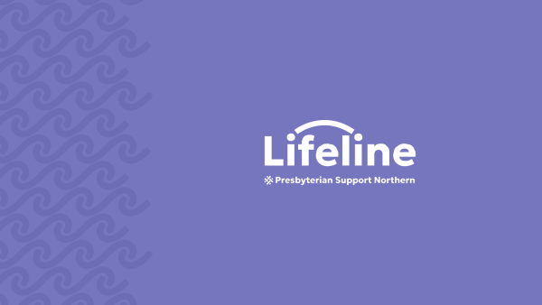
The new logo encapsulates what Lifeline is all about: connection. The design symbolises conversations (kōrerorero) and listening (whakarongorau) between two people, with the letter "i" representing a person.
In addition to the logo, Lifeline has introduced a calming muted purple colour. The updated look also features a ngaru (wave) pattern, representing a waka cutting through the waves on its life journey - an apt metaphor for the support we offer to those navigating life's challenges.
Our sister brands under the Presbyterian Support Northern brand have also been refreshed with a new look and feel, which you can view at the bottom of our website.
Stay tuned as we roll out these changes across all platforms, reinforcing our ongoing commitment to supporting New Zealanders in need.